

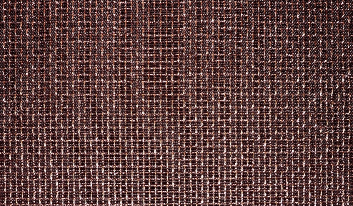
Copper is a generous material. It flatters candlelight, gives kitchen worktops a lived-in warmth and makes even a modest pendant light feel like a considered choice. What it cannot do is rescue a wall colour that fights it. Put polished copper against a cool blue-grey and the metal suddenly looks brassy and orange; set it against stark brilliant white and it can read as slightly grubby, because the contrast is too harsh for a metal that carries so much warmth.
The trick is to think about undertones rather than colour names. Copper sits in the warm half of the spectrum, somewhere between orange and red, so it responds best to walls that share a little of that warmth or that calm it down with muted, dusty depth. Cool, clean, blue-based shades are the ones to approach with caution.
If you only try one family of colours, make it green — but not a bright, sharp green. Think of the soft, greyed greens you find on weathered garden furniture or old tinware. These colours share copper's earthiness and let the metal glow without competing for attention.
In a north-facing room, choose the warmer end of the green spectrum — something with a touch of yellow rather than blue — or the whole scheme can turn chilly after dark.
This is the boldest option, and done well it is stunning. Copper and terracotta are cousins: both are warm, both are slightly dusty, and both look better with a little age on them. A deep brick red or a muted rust on a single chimney breast turns a copper kettle, a row of saucepans or a cluster of copper planters into a proper feature.
The key is to keep the red muted and brown-based rather than pink-based or bright. Anything too saturated will make the copper look flat by comparison. If a full wall feels like too much, try a half-height panelling below a picture rail, or paint the inside of an alcove — copper against a deep earthy red, glimpsed from the hallway, is a lovely thing.
White remains the most popular choice for good reason, but the wrong white undoes copper's warmth. Avoid anything with a blue or violet undertone — those crisp, cool whites beloved of minimalist kitchens. Instead, look for a chalky off-white with a hint of yellow, grey or green, which softens the edge between metal and wall.
Finish matters here. A matt or chalky emulsion absorbs light, so the copper does the reflecting. A high-sheen paint bounces light back at the metal and can make everything look busier than it needs to.
Often overlooked, these tones are quietly brilliant with copper. A dusty pink or a soft clay shade picks up the red in the metal without tipping into full terracotta territory. It is a softer, more romantic pairing — lovely in a bedroom with a copper bedside lamp, or in a bathroom with copper taps and a chalky pink wall behind them.
Keep the pink greyed and muted, never sugary. Think of the colour of old plaster or a faded rose rather than a nursery pink. Pair it with off-white woodwork and a little dark green foliage from a real plant, and the scheme feels settled rather than themed.
Copper changes. New metal is pinkish and bright; after a few years it settles into a deeper, browner tone; left unprotected outdoors it turns green. Whatever you choose needs to work with the copper you have now and the copper you will have in five years. A few practical habits make the decision much easier:
Choose a colour that lets the copper speak rather than one that shouts over it, and the room will feel warmer, calmer and altogether more considered.

Copperedit We spend our time finding what works so you don't have to, and sharing exactly what made the difference.

Copperedit We spend our time finding what works so you don't have to, and sharing exactly what made the difference.

Old copper can look tired when dirt and tarnish build up. Gentle methods using pantry staples can restore shine without damaging delicate finishes.

Comments
ALina Kelian
19th May 2018 ReplyCopperedit An honest, everyday look at the things that make life a little better — with advice you can actually use. ullamco laboris nisi ut aliquip ex ea commodo consequat.
Rlex Kelian
19th May 2018 ReplyCopperedit No rushing, no fuss — just thoughtful notes and practical help, written by people who care. ullamco laboris nisi ut aliquip commodo.
Roboto Alex
21th May 2018 ReplyCopperedit Real stories, useful guides and the occasional recommendation, all in one calm corner of the web. ullamco laboris nisi ut aliquip ex ea commodo consequat.