

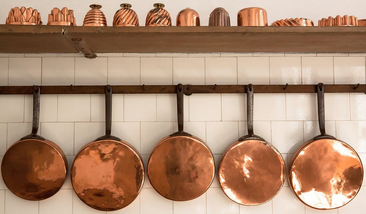
Copper has a way of making a neutral room feel finished without shouting about it. Where brass can read as formal and chrome can feel cold, copper sits somewhere warmer and more relaxed — closer to a glowing ember than a mirror. The trick is restraint. A neutral living room, whether it is built on oatmeal, greige, soft white or mushroom, gives copper a calm stage to work on. Add too much and the space starts to look like a showroom; add just enough and the whole scheme lifts.
Neutral rooms rely on texture rather than colour to create interest. That is exactly why copper fits so neatly into them. It brings a metallic sheen that catches daylight in the afternoon and lamp light in the evening, so the room subtly changes through the day without you repainting a thing.
Copper also has a natural range. Polished pieces are bright and almost pink in tone, while aged or brushed finishes lean brown and bronze. This means you can pick a finish that echoes the undertones of your neutrals. Warm greys and stone tones pair beautifully with aged copper, while cooler whites and pale linens suit brighter, more polished pieces. If your walls are a warm off-white, look for copper with a rosy glow rather than a dark patina.
The single most effective place to introduce copper is at eye level, in the lighting. A copper pendant over a coffee table or reading nook becomes an instant focal point, and because it hangs in the middle of the room, it draws the eye upwards and makes the ceiling feel taller.
Keep bulbs warm — around 2700K — so the metal glows rather than glints. Cool white bulbs make copper look almost orange, which is rarely the effect you want in a calm living room.
If you are not ready to commit to a light fitting, start with objects. Copper responds particularly well to the things we actually use every day, which is what keeps it feeling lived-in rather than precious.
The rule of three works well here. Group copper pieces in odd numbers, vary the heights, and leave plenty of empty space around them. A single well-placed copper bowl reads as intentional; six scattered around the room reads as clutter.
Copper is a hard, cool-to-the-touch material, so it needs softness around it to feel comfortable. This is where your neutral textiles earn their keep.
Think about a chunky wool throw in oatmeal, a boucle cushion in cream, a jute rug underfoot. Velvet in a soft taupe is especially good with copper because both have a low, rich sheen that plays well together. Avoid high-shine fabrics like satin; they compete with the metal rather than supporting it.
Wood is your other ally. Mid-tone oak, walnut and ash all sit comfortably beside copper because they share its warmth. If your room already has wooden floors or a wooden coffee table, you have half the pairing done for you.
Many people worry that copper and brass will clash. In practice, they are close cousins and mix beautifully, provided you give one of them the lead. Choose copper as your primary accent and let brass or black metal appear in smaller doses — a door handle, a lamp base, the legs of a side table.
A simple ratio helps: roughly seventy per cent of your metal accents in copper, thirty per cent in supporting tones. Adding a matte black element, such as a slim floor lamp or a dark picture frame, gives the eye somewhere to rest and stops the metallics feeling sugary.
Copper is a working metal, and it will change. Unlacquered pieces develop a patina over months, shifting from bright salmon to a deeper, browner tone. Some people love this; others prefer to keep the shine. If you want to slow the process, choose lacquered finishes for decorative pieces and keep unlacquered copper for items you are happy to see age.
For cleaning, a soft dry cloth is usually enough. Avoid abrasive pads and harsh chemicals, which scratch the surface and strip the finish. A gentle wipe with a cloth dampened in warm water and mild washing-up liquid, dried immediately, keeps most pieces looking well cared for.
Finally, be practical about placement. Copper conducts heat, so keep candle holders and hot dishes away from anything delicate, and think twice before putting a heavy copper object on a high shelf where it might be knocked. Style it, enjoy it, and let it warm the room quietly from the corner rather than the centre.

Copperedit We spend our time finding what works so you don't have to, and sharing exactly what made the difference.

Copperedit We spend our time finding what works so you don't have to, and sharing exactly what made the difference.

Compare thickness, finish and heat resistance before choosing a copper splashback. This guide covers practical installation points for busy home kitchens.

Comments
ALina Kelian
19th May 2018 ReplyCopperedit An honest, everyday look at the things that make life a little better — with advice you can actually use. ullamco laboris nisi ut aliquip ex ea commodo consequat.
Rlex Kelian
19th May 2018 ReplyCopperedit No rushing, no fuss — just thoughtful notes and practical help, written by people who care. ullamco laboris nisi ut aliquip commodo.
Roboto Alex
21th May 2018 ReplyCopperedit Real stories, useful guides and the occasional recommendation, all in one calm corner of the web. ullamco laboris nisi ut aliquip ex ea commodo consequat.